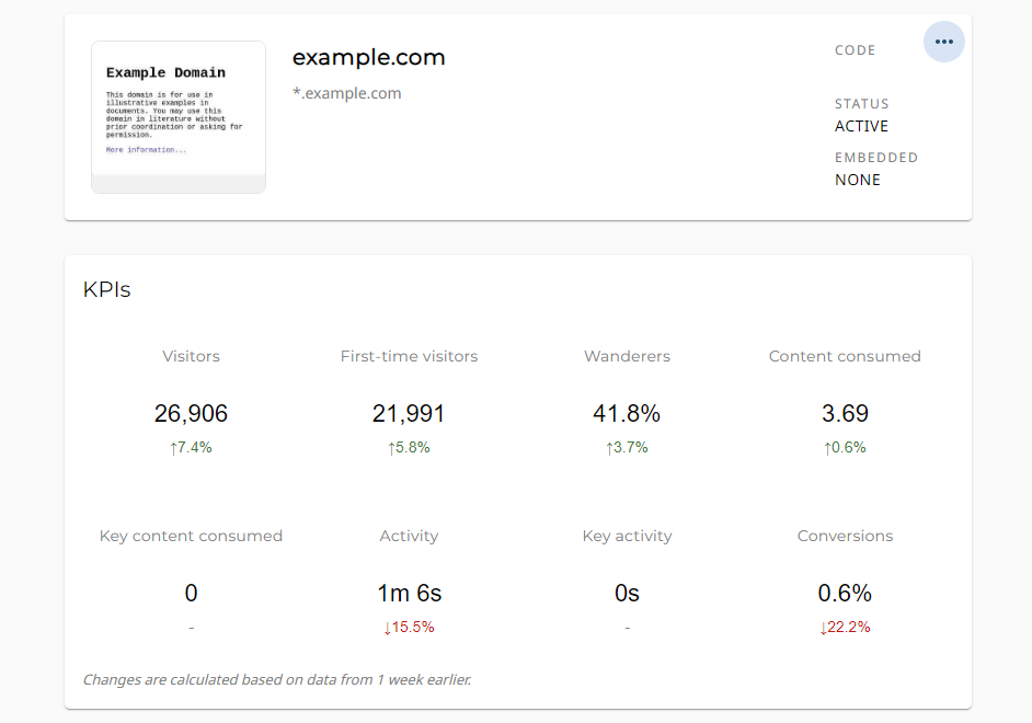
Welcome to the new Navu Analytics. In our 1.22 release, we’re rolling out an improved framework designed to be simpler and more useful for our users.
At their core, Navu’s included analytics are designed to help our users understand their website better. This means providing information about specific user personas, site content, individual journeys, and of course the performance of Navu Guides.
But with so much data at our disposal, it can be easy to fall into the ‘show everything’ trap, overwhelming visitors with a flood of charts and tables of questionable utility. Rather than trying to replace the likes of Google Analytics in your marketing technology stack, we prefer to focus on the areas we know best. That’s why we’ve picked 8 key performance indicators that we can report on site-wide or by segment.
The Metrics
Here are the eight bits of information we’ve chosen to organize analytics around:
- Visitors: How many visitors are you getting? We automatically omit bots, affiliates, and others that will never become customers.
- First-Time Visitors: How many of these visitors are arriving for the first time to your site?
- Wanderers: What fraction of these visitors go beyond the landing page? We see these as the most important group from which you’ll be able to find new qualified leads.
- Content Consumed: How many pieces of different content are those wanderers consuming after they leave the landing page?
- Key Content Consumed: For targetable visitors, how many pieces of the target content you designate are those visitors consuming after landing?
- Activity: How much time are wanderers spending actively consuming content? (This is not just session time, but rather actual time spent reading.)
- Key Activity: For targetable visitors, how much time is spent reading the target content you designate for them after the landing page?
- Conversions: How many conversions are happening? We automatically count a form submission containing identity information as a conversion. (You can choose forms to ignore if needed, such as “unsubscribe” forms.)

Visitor Grouping
We report those same KPIs for a variety of different visitor groupings, providing consistency across the analytics experience and making it easy to understand performance no matter how you choose to segment your site.
The four grouping categories are as follows:
- Site-Wide: Across all visitors to your site (again, ignoring non-qualified visitors)
- Campaigns: Visitors arriving via each acquisition campaign (e.g., based on UTM parameters such as a particular ad, an email newsletter, or a organic-search to a specific piece of content, etc.)
- Segments: Using our new segmentation feature, you can define any segment you want and we’ll report analytics for the visitors in that segment starting from the moment when the segment is defined.
- Guides: Across all of the visitors that have been assigned a particular guide;
When there is a Navu Guide present for an audience, or if an A/B Test is active, we provide additional options:
- All: All visitors in the corresponding visitor group;
- Guided: Only the visitors in the corresponding group that have been assigned a guide;
- A/B Test: Only for visitors that are participants in an a/b test, in which case the data includes a breakdown by test and control group (i.e., those who were shown a guide and those who were not).
Charts, Graphs, and Timetables
There is a new selection field where users can choose any date range they desire, updating the metrics accordingly. For each metric, Navu will tell you not only the value of that metric over the specified period, but also how that metric is changing over time.
For example, you may see that visitors have grown by 10% while conversions have decreased by 4%. This is determined by comparing the data to a corresponding period in the past. That reference period will vary depending on what data is available and the size of the selected date range. Typically, that change will be in comparison with one week or 4 weeks earlier.
In addition to these metrics, the new Navu analytics also include a set of charts to help you visualize some of these data. In the first release, these charts are limited but helpful. The first chart shows you visitors per day and, on the same chart, the fraction of visitors that are guided. Another chart shows you how much visitors are clicking using on-page anchors and how much they are clicking on cards in the guide to get to target content. In future releases, we will add other helpful charts.
If you would like to use these metrics for further analysis, you can download the entire set of metrics for all groups with a single click. This will give you a CSV file that you can import into a spreadsheet and post-process as you like.
What it Means
All Navu subscriptions will be receiving this upgrade to analytics by default. For existing users, this will reflect in your Navu Portal within the next few days. If there are any issues at all, or if you have any questions, please reach out to [email protected].
And if you have other ideas for future analytics releases, let us know! We’d love to hear from you.


